LA Fitness
LA Fitness is a gym chain that can be found in the United States of America. Their objective is to seek innovative ways to build up their members’ physical and emotional well-being.


What I noticed
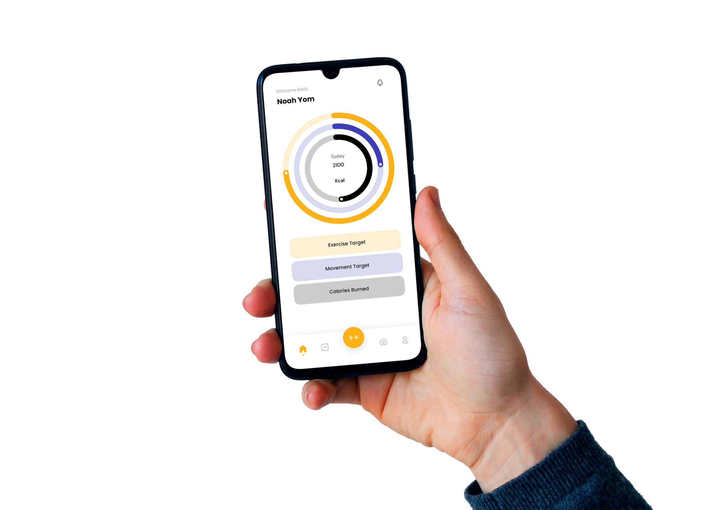
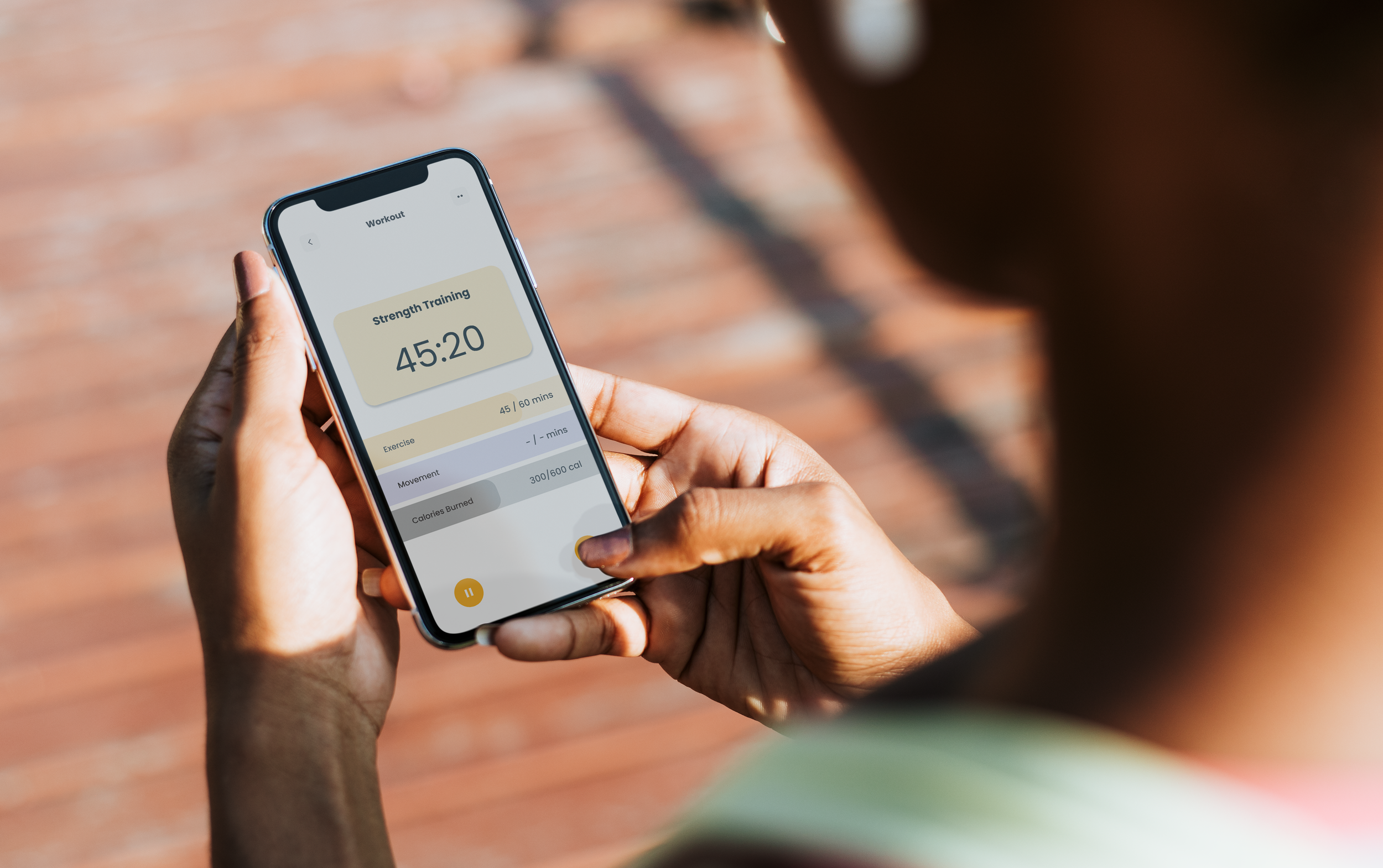
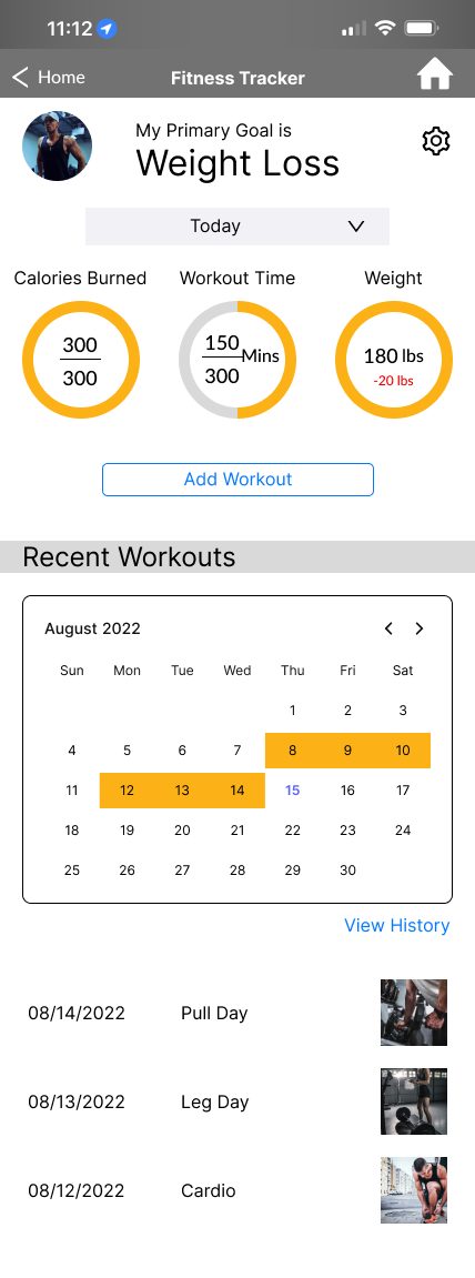
LA Fitness has an app for members to help check-in, schedule activities, and more. One thing that they don’t have is a feature that tracks their workouts. I believe that adding a fitness feature will enhance a user’s experience with the app.
Problems to tackle
How do we personalize an existing app and make it more fitness-friendly and positive?

Goals
In order to tackle the problems above, I decided to focus on designing a fitness feature that can help strengthen the brand's focus on members’ physical and emotional well-being.

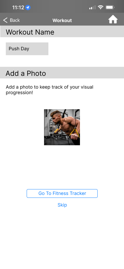
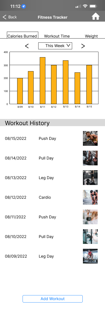
A physical fitness tracker.
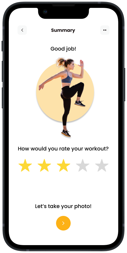
An emotional well-being tracker.

an accessible progress viewer tracker
Research


Competitor Analysis
I conducted research on fitness apps to see opportunities where LA Fitness can benefit from. I was looking for something that supports the physical and emotional well being of its users / members.
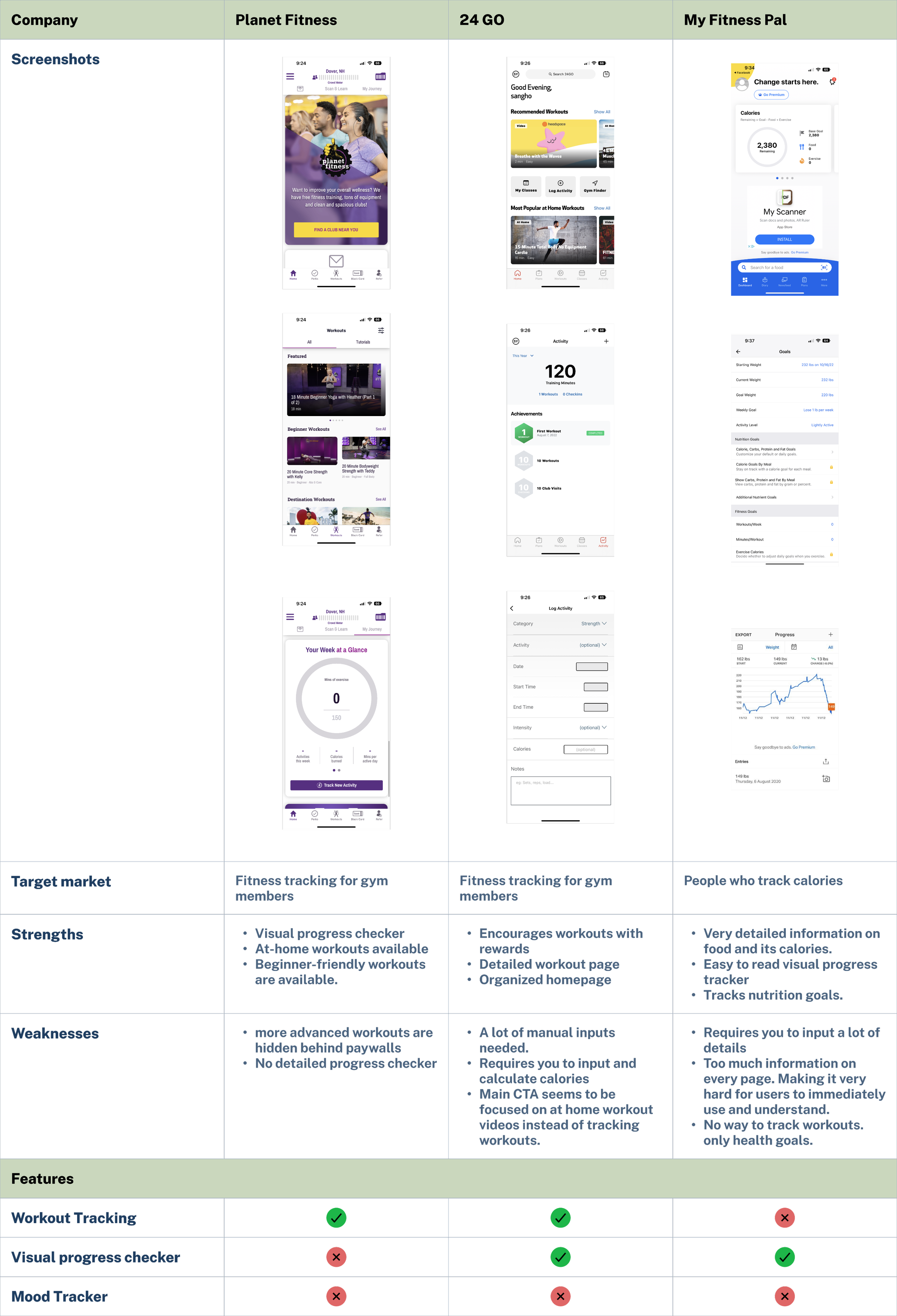
Most gym chains and fitness apps have some sort of feature that tracks workouts, activities, or health goals. But they all prioritize different aspects of health and fitness (calories, weight goals, beginner-friendly workouts, etc). For LA Fitness, I want to focus on simply tracking workouts while humanizing it.
User Insights
To understand newcomer needs, I reached out to church-seekers or recent seekers to pick their brains. A few quotes stood out to me.
“Tracking workouts are tedious so I don’t like using it. But I want to.”
- J, Los Angeles, 31

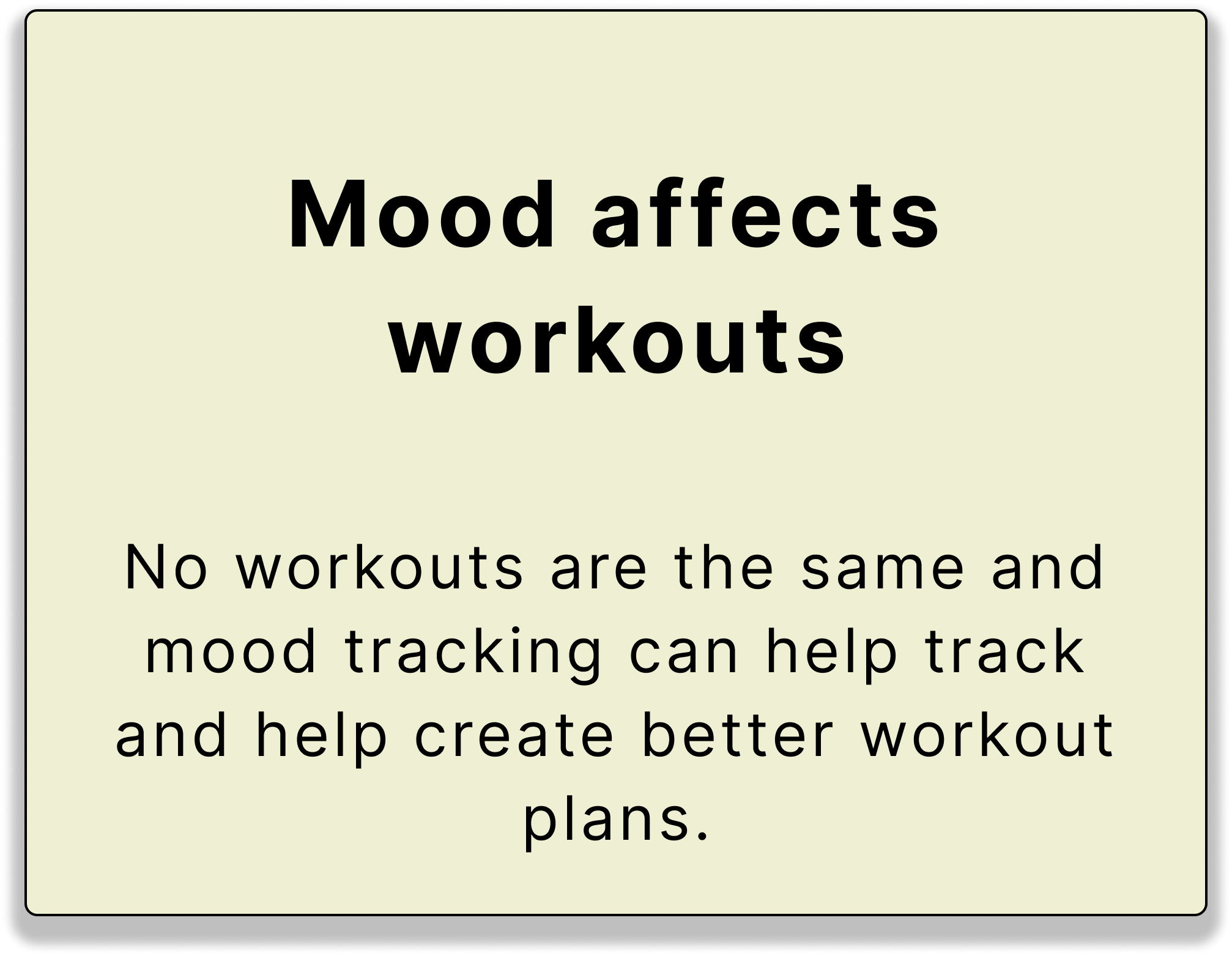
“My strength depends on my mood.”
- S, Irvine, 30
Overall, my gathering pointed towards 3 main points.

“I track using a journal. But would like a place to store visual progress”
- N, Lake Forest, 26

“I want a workout rating system”
- H, Fullerton, 26

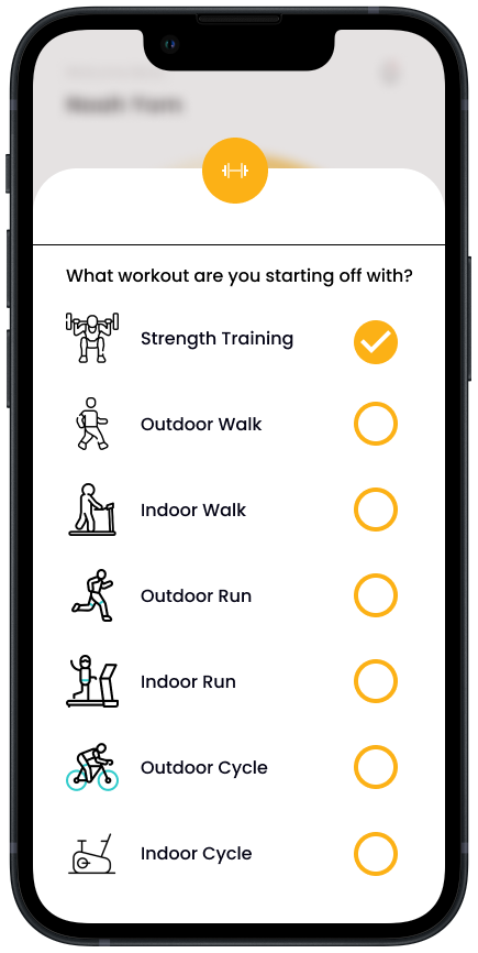
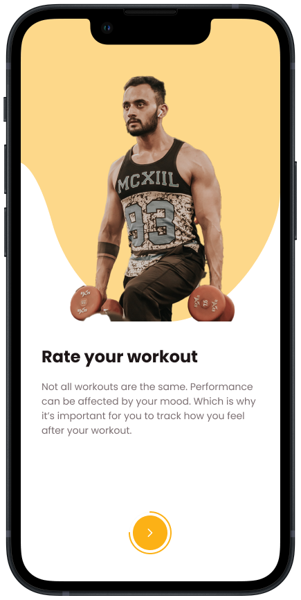
Based on data collected by interviews, this would be the ideal flow for the fitness tracking users.

User Flow
Design


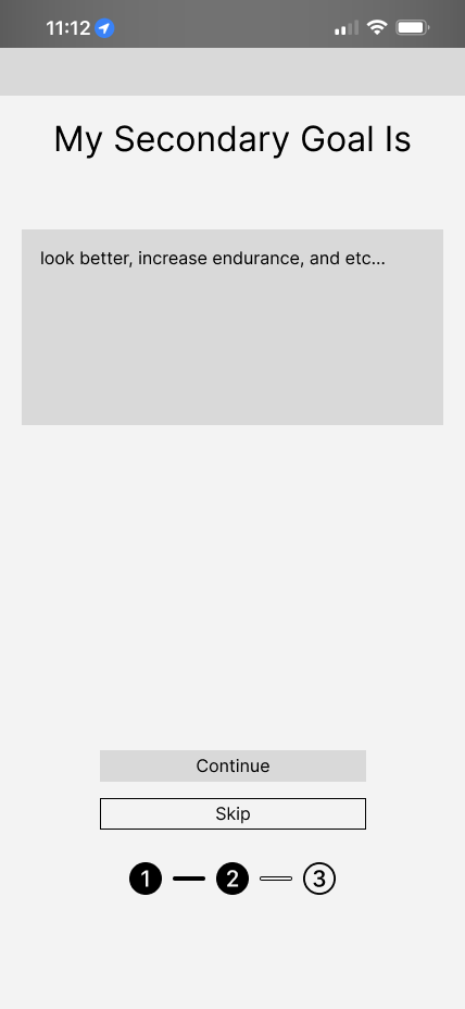
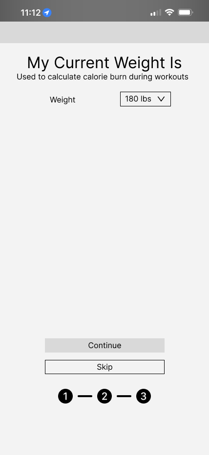
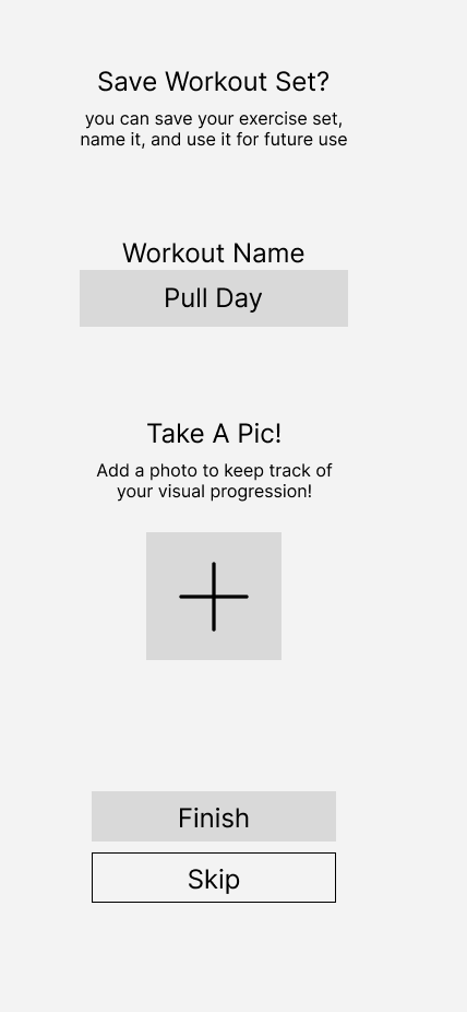
Wireframe


User Testing

100% of users agreed it looked on brand. However, it looked unfinished.

25% of users liked the fitness app. However, everyone mentioned how tedious filling everything out was.

Nobody thought it was very simple and easy to use.
REDO EVERYTHING
After gathering more insights, I redesigned everything and redesign the wireframes, and focused on the following:


User Testing Results
I had users, returning and new, retest my hi-fi and this is what they had to say.

Everyone thought it was visually appealing.

90% of the users liked the workout page and homepage. The 10% thought the pages was too plain for their taste.

Everyone thought it was simple to use and easy to follow.
Key Changes / Importance
After noticing how displeased everyone was, I knew I had to improve the designs. I focused on a few key pages they talked about the most and these were the results.
Before
After

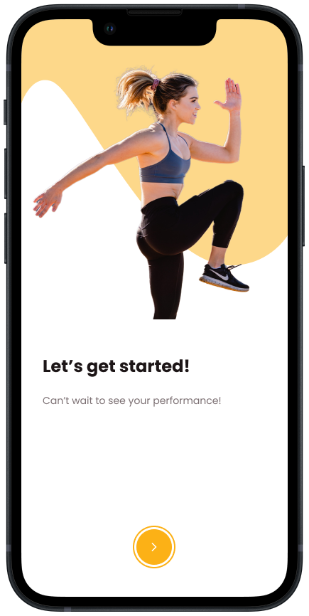
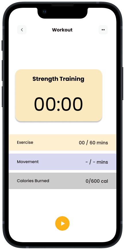
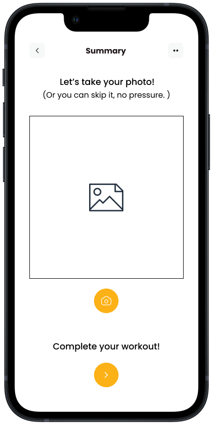
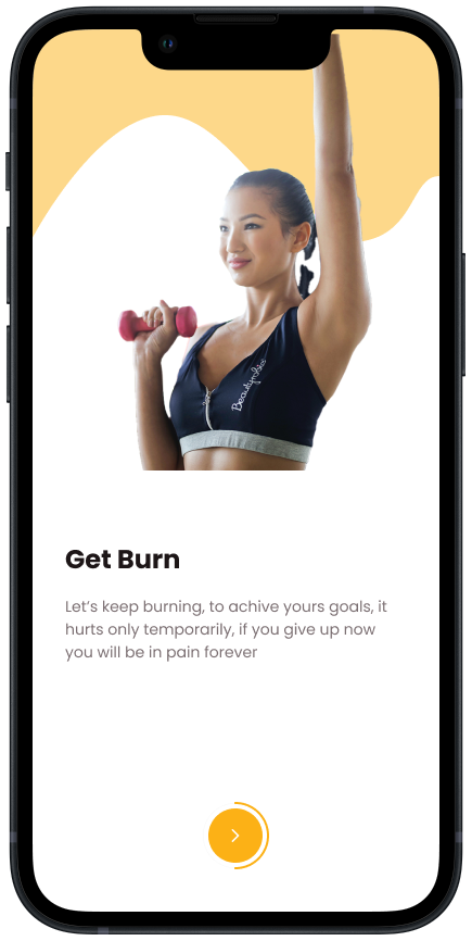
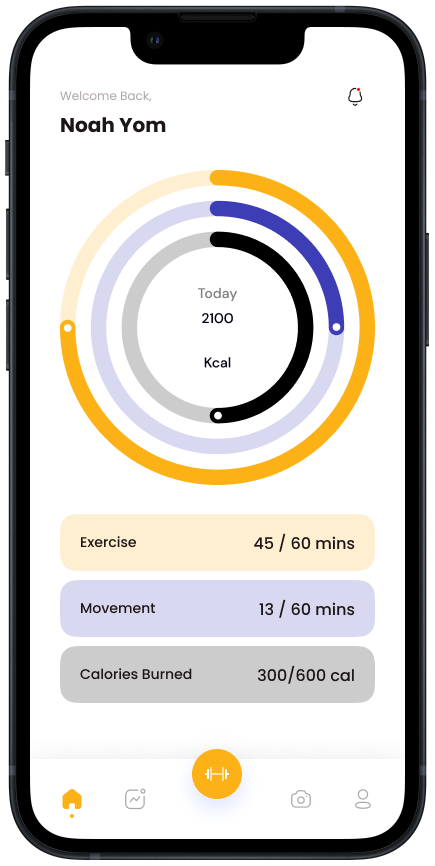
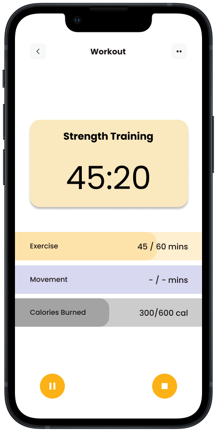
Final Product